Category Archives: Pixel Shavings

Pixel Shavings: It’s About the Story….by Sheralyn Barnes

From: Pixel Shavings
http://pixelshavings.blogspot.com/2011/08/its-about-storyby-sheralyn-barnes.html
August 17, 2011 at 08:13PM

Since my last post, the SCBWI conference in Los Angeles has come and gone. My oh my….what an enlightening event. I encourage anyone who loves children’s books and wants to make a career in making them to go next year if you can. You won’t regret it. It’s amazing, informative, inspiring, fun, exhausting, and yes….frustrating. I’ve been home for over a week now and all the information and experiences are slowly sinking in. I’m realizing just how important that last emotion – frustration- is. It seems equally as important as inspiration in this game. And here’s why….
I’ve spent the last 5 months with my head in the computer trying to hone my skills at painting digitally and I’ve been very happy with my accomplishments. However, after this last conference, I realized that I’ve been ignoring a couple of key elements that are very important to being a good children’s book illustrator. I’ve been ignoring the story and the characters, the two things that make a good book a good book! I realized that I’ve been so involved in making fur look like fur, snow look like snow, and wool look like wool that I haven’t taken the time to really get to know my characters and how they think or explore in depth where they live. It seems crazy to only just now realize this! My training is in fine arts so I was never exposed to the basics of character design (or the importance of thumbnails) in school.  I now realize that I’ve been using my obsessive attention to detail in painting as an excuse to avoid pushing myself out of my artistic comfort zones in illustration.
I can admit this to myself after having had an incredibly enlightening critique with Dan Santat again this year at the conference. In 15 minutes he made a remarkable difference in my perspective on my work. His critique opened my eyes even wider to what I’ve been ignoring.
Here’s what I mean…
I showed him this piece. It is the opening illustration that I did for a final to go with a Christmas book dummy about a rabbit and mouse who hide in an old woman’s barn when a blizzard comes. In this scene, the rabbit is supposed to be anxiously awaiting his mouse friend’s arrival at the rendezvous point so that they can go together to the barn for safety. This is a piece that I’ve been laboring on for the last month (you know…getting that fur and snow just right).

Dan respectfully pointed out to me that what I have painted here is a portrait of a mildly concerned rabbit looking to his left. Then, I threw in a couple of trees to establish that he’s outside and there is snow. That’s it. Think about it, if he was a rabbit actor trying out for the part, he wouldn’t get the role now would he? Now considering that I have sat through six workshops at several SCBWI conferences with the fab art director Laurent Linn in which he very accurately shows the many facets that make a good illustration good (and how a good illustrator is like a good movie director, lighting director, wardrobe designer, etc) I absolutely can’t believe I was so blind to what I had done here! A good children’s book illustration should always intrigue the viewer and make them ask questions about what is going on. The most memorable statement that Dan Santat said to me this time around was…. “Your illustration should tell a story before the text is even added.”
So he gave me some tips on this piece. Here is a rough of possible changes using some of his suggestions.
Since this rough is small on the screen and hard to see I’ll note what I’m aiming at. First, this rabbit is worried, his character is neurotic and he should look as worried as I would be if I was stuck in a car on the freeway in an oncoming blizzard with bad tires. I want to get that across (and intend to work on that expression and body language since it is key to the scene)! My imagined setting is Vermont….with lots of hills, pines and snow. I would have picked my home state of Minnesota, but it’s too flat. So it’s Vermont as I imagine it would be in winter. In the upper right, the barn and house are off in the distance and the incoming snowstorm is already upon them (this is a key location of where the story is taking us). In the middle upper right, the mouse is coming up the hill from the barn (where he’s already been, unknowing to the rabbit who is looking for him to come from another direction).
So it’s a start in a new direction at least. The importance of learning how to move the story forward was reinforced over and over again in workshops in LA with (the amazing illustrator) David Small, (the absolutely amazing Art Director with great hair) Laurent Linn, and (the wonderful art director) Martha Rago. All these people know what they are talking about, so I am eagerly listening and trying to stay all ears and keep my eyes open as much as possible to my own blind spots from here on out! This is why going to conferences is golden. Another reason to go to conferences? I know everyone in Pixel Shaving because of SCBWI conferences. That’s been the icing on the cake! I’ve learned so much from knowing all of them and am so honored to be part of such a talented group of illustrators.
Thanks for tuning in!
Look for another enlightening and fabulous post from Hazel next week!

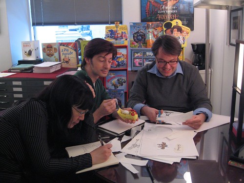
Pixel Shavings: How to Get a Publishing Contract in 3 Easy Steps by Fred Koehler

From: Pixel Shavings
http://pixelshavings.blogspot.com/2012/02/how-to-get-publishing-contract-in-3.html
February 29, 2012 at 08:43AM

Okay, okay. So perhaps that title was a bit deceiving. But, after reading this humorous post on How to Win the Caldecott, I thought I might give it a shot as well. This is a general description of how I sold my first two books to Penguin USA. The first, “Dad’s Bad Day,” will be out in 2014.

Step 1. Get Really, Really Good at Something. Whether it’s writing, illustrating, or even concept and storyboarding, put in the 10,000 hours you need to become successful at your craft. Because all work feeds your art, it doesn’t matter where those hours come from. You want to be a writer? Blog. Volunteer to write press releases for a local charity. Write letters. Just write a lot. Same deal with illustrators. Start a sketch blog and add to it daily. Doodle in meetings instead of paying attention (and convince everyone that you listen best while doodling). One day it’s going to click. Something original is going to emerge from your work. You’ll stop in the middle of what you’re doing and say “Whoah. Where did that come from?” Congrats. You’ve found your voice.

Step 2. Hang Out and Be Cool. For “big people” publishing, I don’t know how to be cool. Grown-ups frighten me honestly. For children’s publishing, join SCBWI and just go and hang out. Invest some dollars. Sign up for multiple classes and critiques at the conferences. Bring your “A” game. Bring the work that embodies that original voice and still makes you say “Whoah” when you look at it. Be proud and be excited about it. And don’t be creepy or stalker-y with the agents and editors you meet. The ones I’ve met still talk to me because my attitude has always been that “I’d love to sell something, but I’m really just here to learn and make friends.”

Step 3. Listen, Learn, and Repeat. At a conference I heard an editor say, “Anyone who submits work to me in the next two weeks hasn’t been paying attention.” The purpose of attending conferences is to learn how to improve our craft for revision. It’s not about landing the deal. When you get that one-on-one time, offer yourself up completely defenseless. Demonstrate your ability to listen and accept advice. And for some people, that’s the hardest part. You’re sitting across from the person who could give you your break, so whatever they tell you to do, DO IT!!! Now go back to Step 1 and repeat until successful. And remember, the equation for success is “Every Single Miserable Failure + One More Try.”

Cheers,

-fred
freddiek.com

Pixel Shavings: Cloudwatching – by Debbie Ridpath Ohi

From: Pixel Shavings
http://pixelshavings.blogspot.com/2012/02/cloudwatching-by-debbie-ridpath-ohi.html
February 22, 2012 at 05:44PM

This piece began as one of my Daily Doodles, where I experimented with a very loose and very sketchy line (no initial sketch/shapes) in Photoshop CS5:

I initially envisioned the little girl and her monster to be on a rooftop, but decided to put her on a hillside looking up at clouds in the sky instead:
I added some subtle shading in the bottom part of the hill to add a feeling of depth. I also used more than one pale grey for the clouds…again to add some texture and depth.
Next, I colored in the girl and the monster. Then, to make the hill look more like a natural part of the illustration, I added grass and flowers:
I drew in the stalks of grass by hand (digitally, that is) but did some cheating — I only did a few sections, then copied and pasted those sections around the hill, altering the rotation a bit so it wouldn’t look so obvious I was cutting and pasting. Then I added in some extra blades of grass here and there by hand.
Here’s a screenshot of my layers, for those curious:
Yes, I love layers!
Next up: the fantabulous FRED KOEHLER.
I’m starting to blog about the process of creating I’m Bored (written by Michael Ian Black, illustrated by yours truly) with Simon & Schuster Books For Young Readers, for those interested. Included: photos, quotes, sketches & process info from the very beginning, working with editor Justin Chanda and art director Laurent Linn, through to finals and launch. I’d be delighted if you joined me.

Pixel Shavings: Gladys And Her Cat by Russ Cox

From: Pixel Shavings
http://pixelshavings.blogspot.com/2012/02/gladys-and-her-cat-by-russ-cox.html
February 15, 2012 at 09:56AM


© 2012 Russ Cox | Smiling Otis Studio
In celebration of Valentine’s Day, I decided to work up a sketch I had lying around my studio that I called “Gladys And Her Cat”. It is based on how children usually carry a cat around the house. I though adding the drawings hanging on the wall would help emphasize her love for her cat.
This is a tighter version of the sketch. I lightened the nose and mouth on Gladys so the line work would not stand out in the final art. The line work was converted to a dark purple to give it a bit more life than using black.

Using the multiply layer in Photoshop, I did a grayscale underpainting which I duplicated and then added a red tint. This makes it a two layer toned underpainting so that I have a dark value to paint on which helps the final art colors pop.

Working like a traditional painting, I started from the back by painting in the walls, patterns, baseboards, and floor. This helps me decide what colors to use for the main images and prevents color revisions later on by trying to get a background color to work with all of the main elements. The final art layers are set to “normal” but have my brushes set to 20-45% opacity. By doing this, it allows me to build up the color.

I then painted the drawings by using a crayon-like brush. I though the paper should be a few colors like construction paper. The dog and mouse were painted next.

Continuing moving to the front, Gladys was painted in the next step. I thought having her as a redhead would help solidify the concept of “love”. 

The valentine’s card and cat were painted. I used my orange cat as a model for color and attitude. Sometimes I will play with the saturation if I find the colors getting flat as I work. Gladys’ skin tone got a mild boost so she looks more lively.

I thought I was about done with the illustration but the floor seemed too bare and boring. Building on the drawings in the background, I decided to add some additional drawings on the floor with a few crayons laying about. I quickly sketched the new items out, scanned them, and added them onto a new layer which I multiplied so the white drops out and the line work is  showing. Working digitally allows one to add and subtract images as they work without having to start over. 

The final image has the new elements painted, some of the line work beefed up and highlights added. 
You can view more of my work at:

Tune in next week to see what the talented Debbie Ohi has up her sleeve!

Pixel Shavings: Illustrating a Non-Fiction Picture Book from Hazel Mitchell

From: Pixel Shavings
http://pixelshavings.blogspot.com/2012/02/illustrating-non-fiction-picture-book.html
February 08, 2012 at 11:08AM

This month saw the publication of a book I illustrated for Charlesbridge Publishing’ imprint Mackinac Island. The book is ‘Hidden New Jersey’ and it’s the third in a series featuring the States.Written by Linda J. Barth (of New Jersey), it’s the first non-fiction book I’ve worked on – and it was quite a challenge! I thought I’d share some of the process looking at how I tackled the illustrations.

The book’s a ‘search and seek’ concept with hidden objects on each page for children to find. There were a LOT of facts to incorporate on each double spread, each featuring a different area of the state.

This book came to me in an unusual way … the developer, Anne Lewis, saw my work on my Facebook Fan Page and emailed me to ask if I’d be interested in doing the book. Hurrah for social networking!

I received the m/s in January 2012. At this point I realized just how much research was involved – I took a big gulp. Each area of the book was broken down into a list of facts and suggestions for hidden objects. The developer suggested I write notes on how I saw the images for each page before I started sketching. This was a great idea and saved me a bunch of time … I spent a couple of weeks looking at images for each page and making rough notes on how I saw then working as a whole. The first thing I realized was that the objects suggested for ‘hiding’ took away many of the options for great compositions … so I asked if I could choose what to hide instead. I began files of images for each illustration, making sure I had many different reference and bearing in mind the copyright restrictions on images. I made my own references sketches and often merged many different views, or worked from out-of-copyright photos. This kind of book is hard – there isn’t time or money to go round taking your own photographs, which would be the ideal situation!

When I felt I’d researched enough I began to make rough sketches of each layout. In this case the rough sketch was pretty much how the finished image turned out.

I also researched the items I would hide on the page (which are all mentioned in the ‘facts’).
I also laid out a page to scale with the hidden objects and blocks for the text.

All the rough sketches went to the developer at Mackinac Island Press for approval .. then it was on to finished pencils.

I worked on all the images at the same stage. There were very few changes … just minor ones to make sure things weren’t in the gutter (page fold) and that the text would fit around the image.

I worked at 150% scale and scanned all the images in at 800dpi, reducing to 400dpi in CMYK at the finished size. It was a LOT of scanning. I think people forget about scanning time … I like to do my outline work by hand and my colouring (in this case) digitally … so scanning and then clean up time can take almost a week or more for a whole book.

NOW the fun part … colouring! I coloured in photoshop … it’s something I have been doing for many years. I still love working by hand, but for a project like this digital painting means I can do it in a few weeks. Otherwise the time to complete this book would have been 3 times as long! (Total time was about 4 months.)

Here is the finished image and below are the hidden objects …
     And this is the finished page in the book!

                                               
One of the hardest parts about tackling this project was no running narrative. Each page is it’s own entity … although we did have a couple of themes running through the book. The kids in the canoe appear on several pages and also a little bumble bee (who is the mascot of the book and the state insect) is on every page doing something different as a little extra thing for children to find.

I also created the front and back cover art and bits and pieces for the verso and title pages.

Now that the book is out there I’ve been busy helping to promote the book … which is when the hard work begins, right?

You can see the book trailer I created herehttp://www.youtube.com/watch?v=uuXJfjc-Dgo
if you want to learn more about how I did the book trailer, please visit my blog.

Hidden New Jersey is available to buy in all good bookstores or online!

Join the Hidden New Jersey Facebook Fan Page! http://www.facebook.com/HiddenNJ

Thanks for dropping by. See more of my work online  http://hazelmitchell.com

Come back next week and visit Pixel Shavings to see what illustrator Russ Cox has in store for us.

Toodles!
Hazel

Pixel Shavings: Maquettetebot – by John Deininger

From: Pixel Shavings
http://pixelshavings.blogspot.com/2012/02/maquettetebot.html
February 01, 2012 at 07:37PM

Expanding on experiments from my post last month: here is a way to use a maquette and Photoshop to build an underpainting.

So it starts with a small thumbnail…

Then a value sketch…

Ok, time to gather some reference of bats and a cool tree…

OK, so the robot is an original character – there is no reference for it. It’s maquette-time!!!

But the robot’s gesture doesn’t have enough weight, like it would have while balancing in a tree; so let’s put him in the crack of a sofa…

Cool. Now let’s put all the reference together in Photoshop…

Now we’re talkin! Time to work over the top of that and establish some linework, color, stars, and texture…

Sweeeeeeeet!

Now this could be used as an underpainting for oils (first printed onto watercolor paper and glazed with matte medium), or as solid reference for a watercolor made from scratch, or finished off in Photoshop using a variety of techniques.

So hopefully that inspired, and maybe annoyed the purists, but it is a fun way to get going on a complex illustration.

And for next week, please set you antennas East to receive some rockin’ work from Hazel Mitchell!!!!

-John

Pixel Shavings: Tea Time by Sheralyn Barnes

From: Pixel Shavings
http://pixelshavings.blogspot.com/2012/01/tea-time-by-sheralyn-barnes.html
January 25, 2012 at 11:03PM

It’s January.
That time of year when the winter doldrums set in.
So this week, as the grey skies were bringing me down,
and I was feeling a bit small,
I thought to myself how nothing beats the winter blues like
a hot cup of tea,
a friend,
and my imagination.
 ©2012 Sheralyn Barnes
 And then I pulled out this old friend again,
who despite appearances,
should be getting us closer to spring here soon…..

 ©2012 Sheralyn Barnes
 Happy Groundhogs day on February 2nd!
Spring will be here before we know it….
Thanks for checking in!
You can see more of my work at 
Look for another great post by
John Deininger next week!

Pixel Shavings: Concept is King and the rest of us are Jokers by Fred Koehler

From: Pixel Shavings
http://pixelshavings.blogspot.com/2012/01/concept-is-king-and-rest-of-us-are.html
January 18, 2012 at 09:07AM

For this week’s post I thought I’d use a recent piece that was entered in the SCBWI Tomie DePaola contest based on the classic tale of Chicken Licken. (The sky is falling! The sky is falling!) You can see everybody’s entries here.

My entry did receive a good number of comments, and a lot of them talked about an appreciation of the “concept” or “idea.” So I thought I’d try and share a little bit as to where and how I find concepts and ideas for illustrations.

To be honest it all starts in a text document before I even pick up a pencil. I ask myself the question “What would make this funny? Or different? Or cool?” That list of answers might hit 30 or 40 before I’m start to go back through and decide which one(s) to research further. A lot of times I try to take what’s expected and do the exact opposite. (Instead of “eating pancakes for breakfast,” try “pancakes eating their breakfast.”)

For the Chicken Licken story, my list included “looking through a hole in the sky” and “24 [the tv show] cut-scenes.” Those two stood out and I sketched them, but wasn’t thrilled with the results. But here’s the cool part. In doing the sketches and researching the characters, I kept my eyes open for other concepts to add to the list. I talked through the sketches with friends and colleagues and my list of concepts grew even bigger.

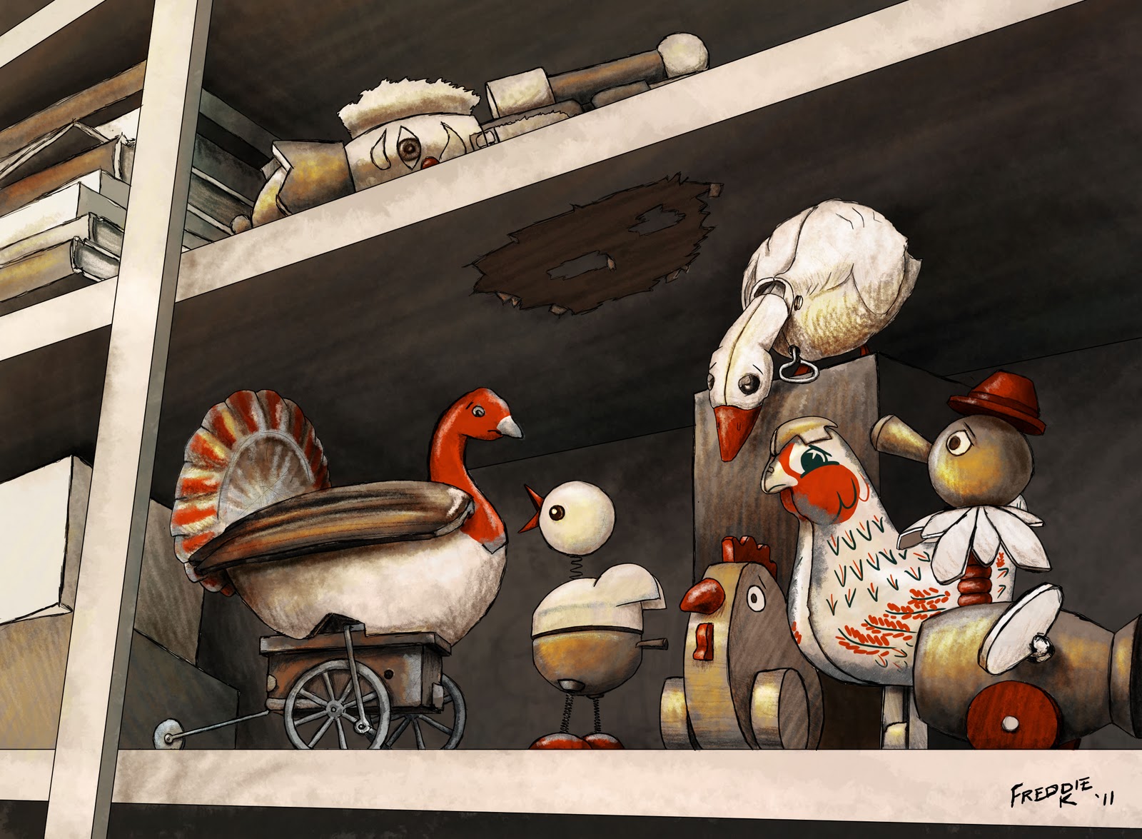
During this process, lo and behold I encountered a vision of the holy grail of comic iconography – a rubber chicken. And where do rubber chickens live? In a toy box. From there I started wondering if there was an iconic toy counterpart to all of the other characters. Lo and behold there was! As I finished my research I never even ended up using the rubber chicken, but that’s where it all started.

Then, after all that, I did sketches. I decided on a vintage palette and a toy shelf instead of a toy box (so it would be easier for the “sky” to be falling). The result, I thought, was successful.

I titled this blog “Concept is King” because I honestly believe that the work we do before ever setting pencil to paper is the most important. The magic of our character interactions, the reaction we hope to get from our viewer – we can document those intentions and work till we achieve them.

Best of luck to all of ya, and keep up the good work!

~Fred
flikr.com/superfredd

Pixel Shavings: I’M BORED book illustration from sketch to final – by Debbie Ridpath Ohi

From: Pixel Shavings
http://pixelshavings.blogspot.com/2012/01/im-bored-book-illustration-from-sketch.html
January 11, 2012 at 08:41AM

In this post, I’m going to show the step-by-step evolution of one of the images from I’M BORED, a new picture book from Michael Ian Black and illustrated by yours truly. You can see a bigger version of the spread above on the Simon & Schuster website graphic excerpt page from I’M BORED.
Above: an early version of the “little girl pretending to be a rampaging monster” image. I made the notes during a meeting with Justin Chanda (publisher & editor) and Laurent Linn (my art director).
They loved the monster hat on the girl, but wanted the girl’s mouth to look more interesting and suggested making it look a bit more like the monster’s somehow. We also decided at this point to make any fantasy elements in the story easier to separate from the real-life elements by coloring them blue.
Above: the preliminary sketch for my revamped drawing. My sketches tend to be very loose, as you can tell, mainly to block in the shapes. Next, I added the line art:
Then I added the fantasy elements in the background (the town), color and the woodcut finish to the line art.
At my next meeting with Justin and Laurent, we decided to color in the girl’s mouth throughout the book and to move the potato to the foreground where it would be more noticeable. Plus I needed to add the screaming people back into image (oops, I’d forgotten them). Here are my notes during the meeting:
And here’s the revamped image:
In the final layout, Laurent flipped the image so it would work better with the overall spread, then added text:
I LOVE how it turned out and can’t wait to see this book on the shelves.
I’ll be talking more about the process of creating I’M BORED with Simon & Schuster Books For Young Readers in the I’M BORED Facebook Page, so please do bookmark/Like.
Next up on Pixel Shavings: the fabulous Fred Koehler!
For more info about my projects, please visit DebbieOhi.com. I blog about kidlit/YA writing and illustrating at Inkygirl.com.